I think it's high time I update my mantel. I've changed it a little bit over the past 4 years we've been in this house, but it's time for an overall new look. I've stuck to a gold tone because of the pictures flanking the mantel and because it flows. I tend to match most things, and I really need to step out of my comfort zone more when it comes to mixing up colors and patterns.
I admit house updates really took the back burner with back to back pregnancies and just trying to stay sane raising the children. Between them, just maintaining the house ,, H's job and me running a business, decorating the house just hasn't been a huge priority. Little by little we are starting on it again because we would like to move within the next 2 years. This house is charming and there are so many wonderful memories, but it's an older house that we have outgrown, and you know what they say about older houses. "If you aren't working on a project every week, you're behind."
When we first bought the house, this was my inspiration for the living room
The first thing I did was paint the walls a color similar. I went with toasted almond. Then I went on the hunt for a chandelier. I checked craigslist first and found an awesome iron one that actually once graced one of the conference rooms in the University of Texas. Originally it was an awful brown shade, but nothing a little can of white spray paint can't fix!
Next came finding somewhat victorian yet modern sofa's. The style of the house is victorian so I wanted to sort of stay with that throughout the house. The sofa's and then a lovely little tapestry chair was found through two different furniture stores and the Hooker TV console was found at Dillard's. The two paintings are Slava Bradinsky we acquired on our honeymoon.
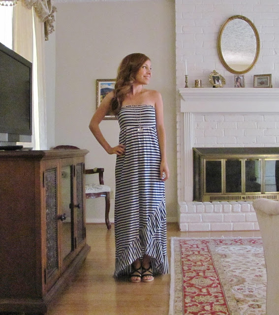
Over time we added a custom cigar humidifier my husband refurbished from an old radio console, a Jaipur rug, and an antique mirror to hang over the fire place.
So I ended up straying from the original inspiration as you can see, but I'm happy with the living room...aside from the giant mound of toys hidden in the corner, or the princess tent that has now taken residence along another wall, but such is the life with small children. What I need most help on is the mantel. Here is an up close mantel picture from Layla's birthday party. I only had the collage up that day.
Another picture of the mantel in the background and more of the living room
Do you all have any suggestions as far as what decorations, picture frame choices would look good? I'm off to find some inspiration too and I'll make a separate post.


can you take off the fireplace doors? we did that to ours then opened it on the other side and love it! we don't use it though. also, maybe paint the mantel a different color and then hang a painting above it instead of the mirror and then put a couple of tiny potted plants on the mantle? that would probably be a little more of a modern touch, so i don't know if that is really your style or what you are looking for.
ReplyDeleteThanks for the suggestions :). I think keeping the doors helps as it keeps the kids out of the fireplace and I love the white brick, however I think the mirror should probably go now that you mentioned a painting. The mirror seems small for that space and it is giving the living room a more outdated look. We do like the antiquey vintage look, but we also don't want it to look completely outdated. Some modern touches are good.
ReplyDelete